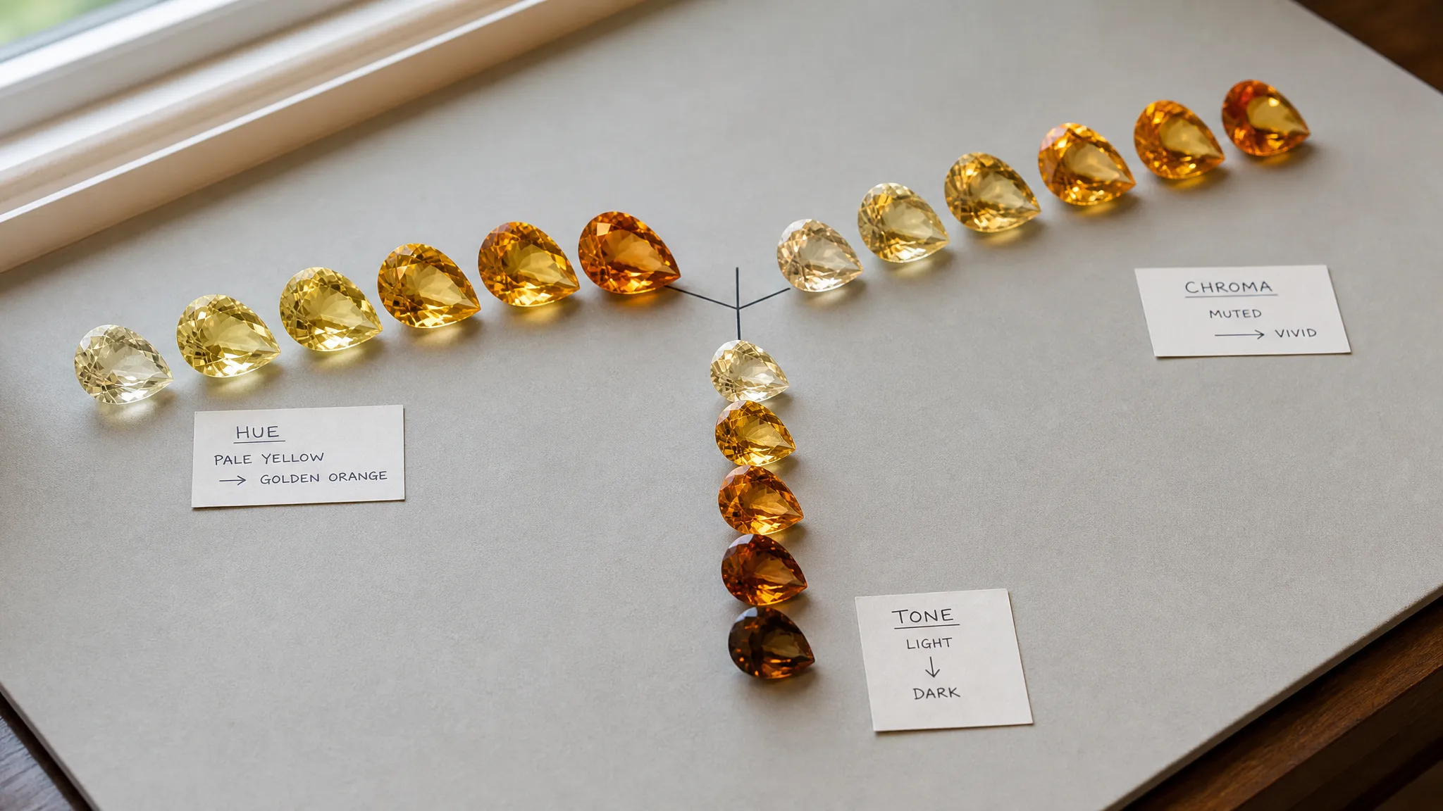
The 3D Coordinate System for Accurate Gemstone Value Calibration
Citrine Color Calibration is best used as a practical comparison language, not as a certified grading method. The “3D coordinate system” is simple: hue, saturation or chroma, and tone or lightness.
- Hue asks whether the citrine reads as pale yellow, yellow-orange, golden orange, brownish orange, smoky yellow-brown, or another nearby impression.
- Saturation / chroma asks how strong, clean, muted, or diluted the color appears.
- Tone / lightness asks how light or dark the stone looks overall.
Together, these three coordinates make citrine color easier to compare and easier to discuss. They do not prove origin, treatment history, rarity, resale potential, or “investment-grade” value.
broader context
Citrine verification note
This narrower page works best after the broader citrine reference page.
The three coordinates: hue, saturation, and tone
A citrine color chart is only useful when it separates three things people often blend into one vague word: the color family, the strength of that color, and the stone’s lightness or darkness.
Hue is the basic color direction. In citrine, common descriptions may move from pale yellow to yellow-orange, golden orange, brownish orange, or smoky tea-like tones. A good hue comparison does not need to force every stone into a premium label. It simply asks: what is the dominant color impression, and is there a visible secondary modifier?
Examples
- A pale yellow citrine and a golden orange citrine may both be citrine, but they do not give the same visual impression.
- A brownish orange citrine may look rich to one buyer and too dark or smoky to another.
- A seller term such as “lemon,” “golden,” or “Madeira” may still need clearer description before two stones can be compared fairly.
Saturation, often discussed with chroma, describes how strong or pure the color appears. A low-saturation citrine may look washed, grayish, brownish, or muted. A higher-saturation citrine may look more vivid, as long as the stone is not so dark that the color becomes hard to read.
Tone, or lightness, describes the overall light-to-dark appearance. This matters because a citrine can be bright but not deeply colored, or strongly colored but too dark in certain lighting. Tone is often the reason two stones with similar hue labels look different side by side.
Clearer citrine color notes
- “Light yellow-orange, low to moderate saturation”
- “Medium golden orange, moderate saturation”
- “Medium-dark brownish orange, strong color but subdued by tone”
- “Pale yellow, bright tone, low saturation”
That language is less dramatic than sales copy, but it is much more useful for comparison.
Why this helps value conversations
Color is one of the first things people notice in a faceted colored gemstone. A shared color language makes citrine value conversations less slippery because it turns broad claims such as “premium golden,” “deep,” “rare color,” or “investment grade” into observable features.
The framework helps in three ways.
It separates preference from description
One buyer may love light yellow citrine because it feels fresh and bright. Another may prefer warmer orange material. Those are taste judgments. Hue, saturation, and tone let both people describe what they are seeing before deciding what they personally value.
It makes comparison more consistent
If two citrines are photographed under different lighting, set in different metals, or cut with different proportions, their color may not be directly comparable. A hue-saturation-tone framework encourages a slower check: dominant hue first, color strength second, overall lightness or darkness third.
It keeps value language from becoming automatic
A strong orange appearance may influence desirability in some market settings, but color alone is not a complete valuation system. Gemstone value may also involve size, cut quality, clarity, transparency, condition, treatment disclosure, documentation, seller credibility, and demand.
That is why “investment-grade citrine” should be treated as a claim to unpack, not a standard category to accept. If the phrase appears, the useful question is: what exactly is being claimed—color, size, natural origin, lack of treatment, documentation, rarity, resale demand, or simply marketing appeal?
A practical citrine color chart framework
A working citrine color chart does not need to assign a final score. It can be a note-taking grid for comparing stones in the same viewing session.
Then combine the observations into one sentence:
“This citrine appears medium yellow-orange, with moderate saturation and a bright medium tone.”
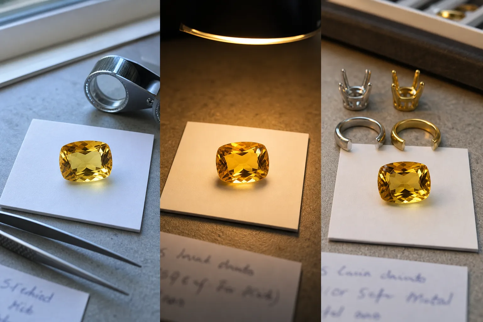
That is more useful than saying only “nice golden citrine.” It also avoids pretending that a single color code can settle value. Numeric, chart-based, or software-assisted color references can be useful under controlled conditions, but a faceted gemstone is not a flat color swatch. Reflections, extinction, windowing, body color, lighting, and viewing angle all affect what the eye sees.
For everyday comparison, try to compare like with like
- View stones under similar lighting.
- Compare loose stones with loose stones when possible, or mounted stones with mounted stones.
- Notice whether the color changes when the stone is tilted.
- Separate the face-up appearance from the color seen through the side.
- Be cautious with seller photos when white balance, background, or editing is unclear.
This does not make a buyer into a laboratory grader. It simply makes the color conversation more grounded.
What can change the color impression
The 3D framework works best as a language tool, but several conditions can change how reliable a comparison feels.
Lighting matters
Warm indoor light can make yellow-orange stones look richer. Cooler daylight-balanced lighting may make brownish or grayish modifiers easier to notice. A stone that looks glowing in one setting may look quieter in another.
Cut affects visible color
In faceted gemstones, brightness and darkness come not only from the material’s body color but also from reflections, leakage, and extinction. A deep or poorly proportioned cut can make parts of the stone look blackened. A shallow or windowed cut can make the center look weaker.
Setting color can shift perception
Yellow metal may make warm citrine colors look more unified. White metal may make pale stones look cooler or make brownish modifiers easier to see. The stone itself has not changed; the viewing context has.
Treatment and identity questions sit outside color description
Citrine is a quartz variety, and the market includes stones with different color histories. Color alone is not a dependable way to establish that history. If natural versus treated material matters to the decision, hue, saturation, and tone are only the start of the conversation, not the verification step.
Market vocabulary is uneven
Terms such as “golden,” “Madeira,” “lemon,” “deep,” “vivid,” or “smoky” may describe a general impression, but they are not automatically standardized citrine valuation categories. A safer approach is to translate them back into hue, saturation, and tone before attaching any value conclusion.
Where color calibration stops
There is no single universal public citrine color grading system that converts hue, saturation, and tone into a guaranteed price, quality rank, or investment threshold. Color-science and gemological sources support the idea that gemstone color can be described more systematically, and citrine-specific colorimetry research has measured hue, lightness, and chroma. That still does not create a complete consumer-facing valuation formula.
Use the framework for
- comparing two citrines more clearly;
- asking better seller questions;
- noticing when a color description is too vague;
- separating color preference from value claims;
- documenting why one stone appears brighter, darker, warmer, or more muted than another.
Do not use it for
- declaring a stone certified or investment-grade;
- proving natural origin or treatment status;
- assigning a lab-equivalent grade;
- predicting resale performance;
- replacing an appraisal, report, or professional examination when those are needed.
That boundary is what keeps the framework useful.
A quick way to use it
Before reacting to the price, write one line about the color:
- Hue: What is the dominant color family?
- Saturation: Is the color weak, muted, moderate, strong, or vivid-looking?
- Tone: Is the stone light, medium, medium-dark, or dark?
- Modifier: Do you see brown, gray, smoky, or orange influence?
- Viewing condition: Was it seen in daylight, warm indoor light, seller photography, or mixed lighting?
- Value boundary: What else supports the asking price besides color?
A useful note might read:
“Medium golden orange citrine, moderate-to-strong saturation, medium tone, slight brownish warmth in indoor light; price should still be checked against size, cut, clarity, treatment disclosure, and documentation.”
That is accurate gemstone value calibration in the modest sense: not a promise of market value, but a disciplined way to describe what the eye is seeing.
Bottom line
The 3D coordinate system for citrine color is hue, saturation or chroma, and tone or lightness. It is a strong practical language for Citrine Color Calibration because it turns vague color praise into clearer comparison notes.
Use it to describe citrine color more accurately, question value-loaded wording, and compare stones under similar conditions. Do not use it as a stand-alone appraisal, a treatment test, or proof of investment-grade value.